I thought building a dark-themed website would be simple.
Pick a color palette.
Design clean UI.
Apply it consistently.
Done… right?
Yeah… no 😄
The Goal Was Clear
I wanted a premium dark-only experience.
No light mode.
No switching.
No compromises.
Just one consistent design that looks the same on every device.
And honestly — everything looked perfect.
Chrome? Perfect.
Edge? Perfect.
Safari? Beautiful.
I was feeling like a frontend genius for about 10 minutes.
Then reality showed up.
The Moment Everything Broke
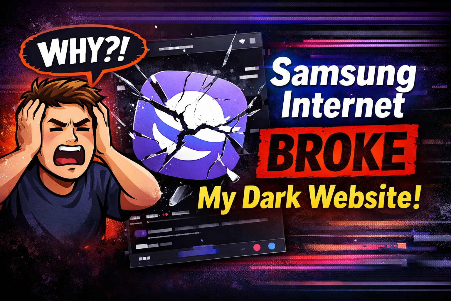
My client opened the site on Samsung Internet.
And to both his and my surprise…
👉 The logo was inverted
👉 The page didn’t look right
At first, I thought:
“Nice… I’ve broken production 👍”
So I went back, checked everything again…
CSS? Fine.
Colors? Fine.
Structure? Clean.
Even refreshed like 7 times (as if that helps 😄).
Still broken.
That’s when the doubt kicks in…
“Is it me… or is it the browser?”
That’s Where Everything Fell Apart
After digging further, I noticed something even stranger…
👉 Only a few things were changed
👉 While others remained exactly as they were
Which somehow made it worse.
Because now it wasn’t fully broken…
It was selectively broken.
The Weirdest Bug I’ve Ever Faced
It wasn’t like a normal bug where everything breaks.
This was smarter than that.
- Backgrounds? Fine
- Text? Fine
- Gradients? Nope
- Glass effects? Gone
- Overlays? Confused
- Logo? Having an identity crisis
It felt like the browser was sitting there like:
“Hmm… I like this part. I’ll keep it.
This part? Yeah… I’ll redesign it for you.”
And even after I fixed a few things…
👉 some elements stayed correct
👉 while others were still being changed by Samsung 😔
At this point, I wasn’t debugging anymore… I was negotiating.
The Reality: It Wasn’t Random
After digging deeper, I realized something important:
Samsung Internet doesn’t treat all elements equally.
It silently modifies certain types of styles:
- Transparent colors (
rgba) - Gradients
- Low opacity layers
- Backdrop blur effects
- Overlay elements
Meanwhile, solid colors stay untouched.
So basically:
👉 “Simple stuff = approved”
👉 “Fancy UI = I’ll handle it 😎”
The Real Problem
The issue wasn’t my code.
(That hurt a little to accept, not gonna lie.)
The issue was this:
The browser was trying to “improve” my design.
Even though I had already built a proper dark interface,
Samsung Internet still applied its own adjustments on top.
So my design became:
Dark UI + Samsung’s creative direction
And let’s just say… we had different visions.
The Breaking Point
At one stage, I had:
- Fixed the meta tags
- Declared dark mode properly
- Clean CSS structure
And still…
👉 Some elements changed
👉 Some didn’t
That’s when I knew:
This is not a bug.
This is a personality.
The Turning Point
Instead of trying to fight the browser…
I changed my approach.
I stopped asking:
“How do I make this compatible?”
And started asking:
“How do I reduce the damage as much as possible?”
What Actually Helped
The solution wasn’t a plugin.
(It never is 😄)
It wasn’t a magic setting either.
It was about taking as much control as possible:
- Locking the site into a dark-only mode
- Reducing ultra-transparent layers
- Strengthening gradients and backgrounds
- Trying to limit where the browser interferes
And yes…
👉 it improved things a lot
👉 but it didn’t make it perfect
The Honest Result
After all the fixes…
- Most of the site looked correct
- The major issues were reduced
- The experience became much better
But still…
👉 a few elements behaved differently
👉 some effects weren’t 100% consistent
And that’s something you just have to accept (for now).
What This Experience Taught Me
This wasn’t just a bug fix.
It was a reality check.
1. Not all browsers respect your design
Some of them… really don’t 😄
2. “Fixing it” doesn’t always mean perfect
Sometimes it just means “better than before”
3. Transparency and effects are fragile
The more advanced your UI, the more unpredictable it becomes
4. Testing is everything
Because your client will open it on that one browser you didn’t test
Final Thought
Building a beautiful interface is one thing.
Making sure it looks exactly the same everywhere?
That’s a different game.
And sometimes…
you don’t win completely.
🚀 If you’re building modern UI…
Do your best.
Control what you can.
And be ready for Samsung 😄